MKT APT
Originally with a very segmented plan and a certain lack of natural lighting, the renovation project of this apartment in the Rio de Janeiro sought to unite its spaces, while maximizing its openings.
In order to ensure greater use and integration of the spaces, the perimeter of the existing balcony received an expansion of the coverage, while the boundary walls between the internal and external space were removed, giving rise to the large living room, in turn connected to the kitchen, office and a small terrace.
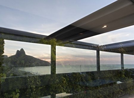
To make better use of natural lighting, architectural strategies were defined along with the renovation, such as the adoption of new glass frames on the main facade; openings along other surfaces; and skylight in the new metal roof. These changes made it possible for there to also be greater benefit from ventilation, directly impacting the thermal quality of the interior.
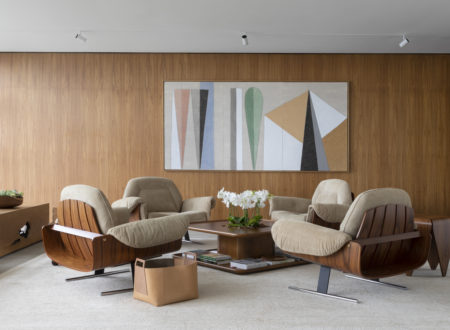
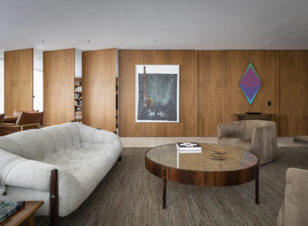
Materially, the project was designed trying to bring different nuances and natural textures. The two central pillars that divide the living room were kept in exposed concrete, while the entire floor received wooden boards, and the lining was partially made of wooden rulers.
In the living room, the long sofa over 8 meters lenght runs all the space, suggesting moments of conversation. In furniture, pieces that evoke the Brazilianness of modern national design were categorically chosen, such as the Mole armchairs by Sérgio Rodrigues, Bordadeira Girafa chair by Lina Bo Bardi, and a pair of Lenço coffee tables designed by Jorge Zalszupin, in harmony with the artisanal ones, such as the Xingu benches and straw basketwork.
To accommodate the collection of books and objects, the linear shelf runs along the entire edge, sometimes as a storage area, sometimes as an exhibitor, up to the toilet, where the corian tub follows the same modulation and mimics the finish applied to the joinery.
Taking advantage of the position of the two central pillars, it was decided to re-signify the role assumed in the space, transforming them into structural elements for the two tables, the first being for dinner (1.80×1.80 meters) and the second as support to the work area (with 1.80×1.00 meters), which appearing to float by the space, from its the metallic strap system, responsible by supporting a beam and plate of the same material, from which the freijó wood base massive is arranged. In composition, straw chairs designed by Sergio Rodrigues and Maru pendant, by Ingo Maurer. At the table opposite, chairs by Martin Eisler.
Visually connecting the different spaces and enabling functionality, the kitchen was opened to the dining room, but with the possibility of being completely closed, from the retraction of the sliding panel, which becomes a wall to support to artworks.
The small access balcony to the upper terrace gained a vertical garden, from where a small opening emerges framing the landscape. Two Loop armchairs, designed by Willy Guhl, make up the circulation.
As in the social area, in the bedrooms, there was the introduction of new frames and from where a system of horizontal louvers was installed, contributing to the exchange of air.
Bringing visual identity to the bathrooms, hydraulic tiles cover the surfaces of the walls, which have their colors highlighted by the zenithal lighting
Local:
Rio de Janeiro, Brazil
Project date:
2019
Area
239 m²
Architecture:
Bernardes Arquitetura
Interiors:
Bernardes Arquitetura
Team:
Thiago Bernardes, Antonia Bernardes, Francisco Abreu, Caroline Premoli, Thais Villar, Manuela Portella, Paulo Martins
Landscape architecture:
Semear Paisagismo
Lighting:
Lightworks Iluminação
Photos:
Ruy Teixeira


